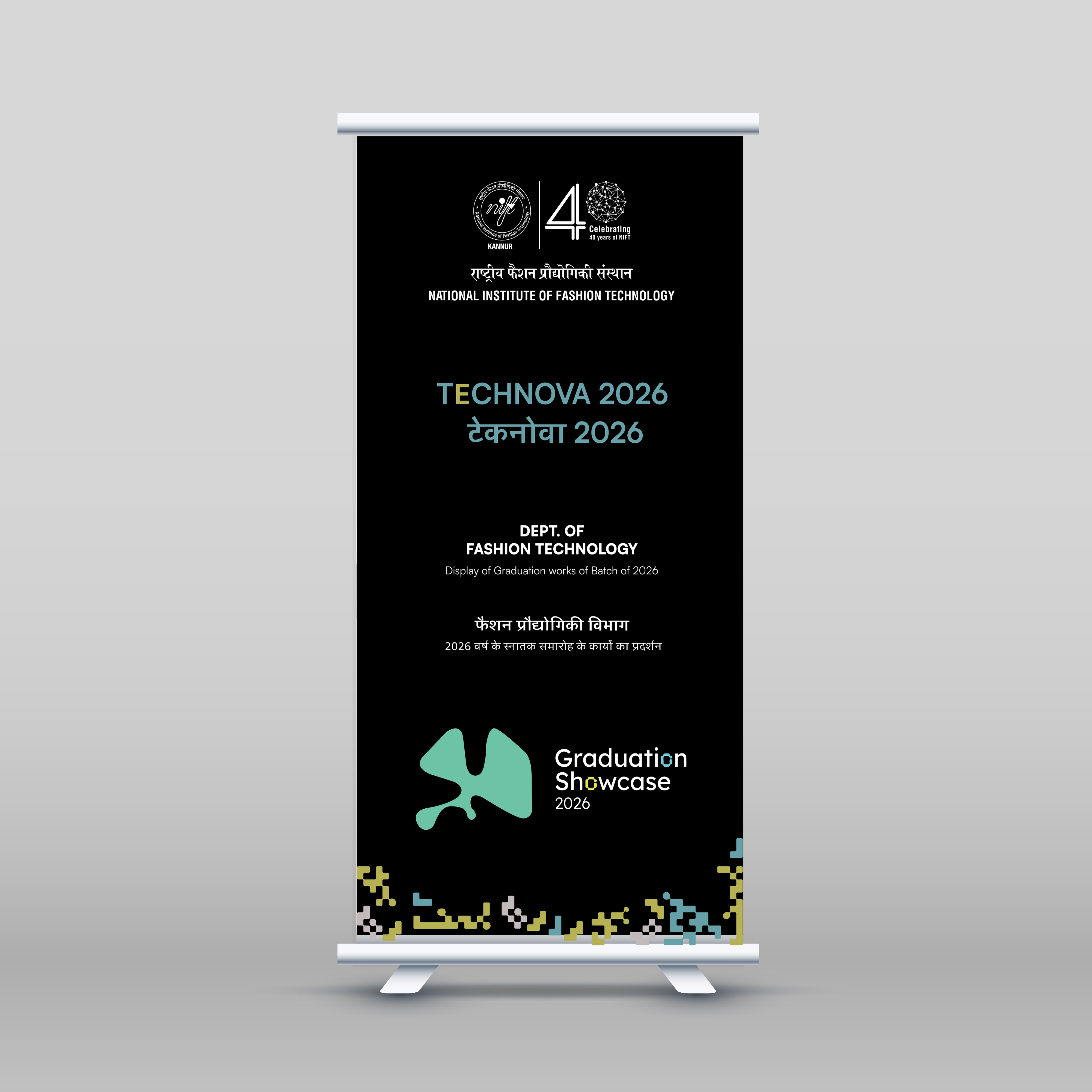
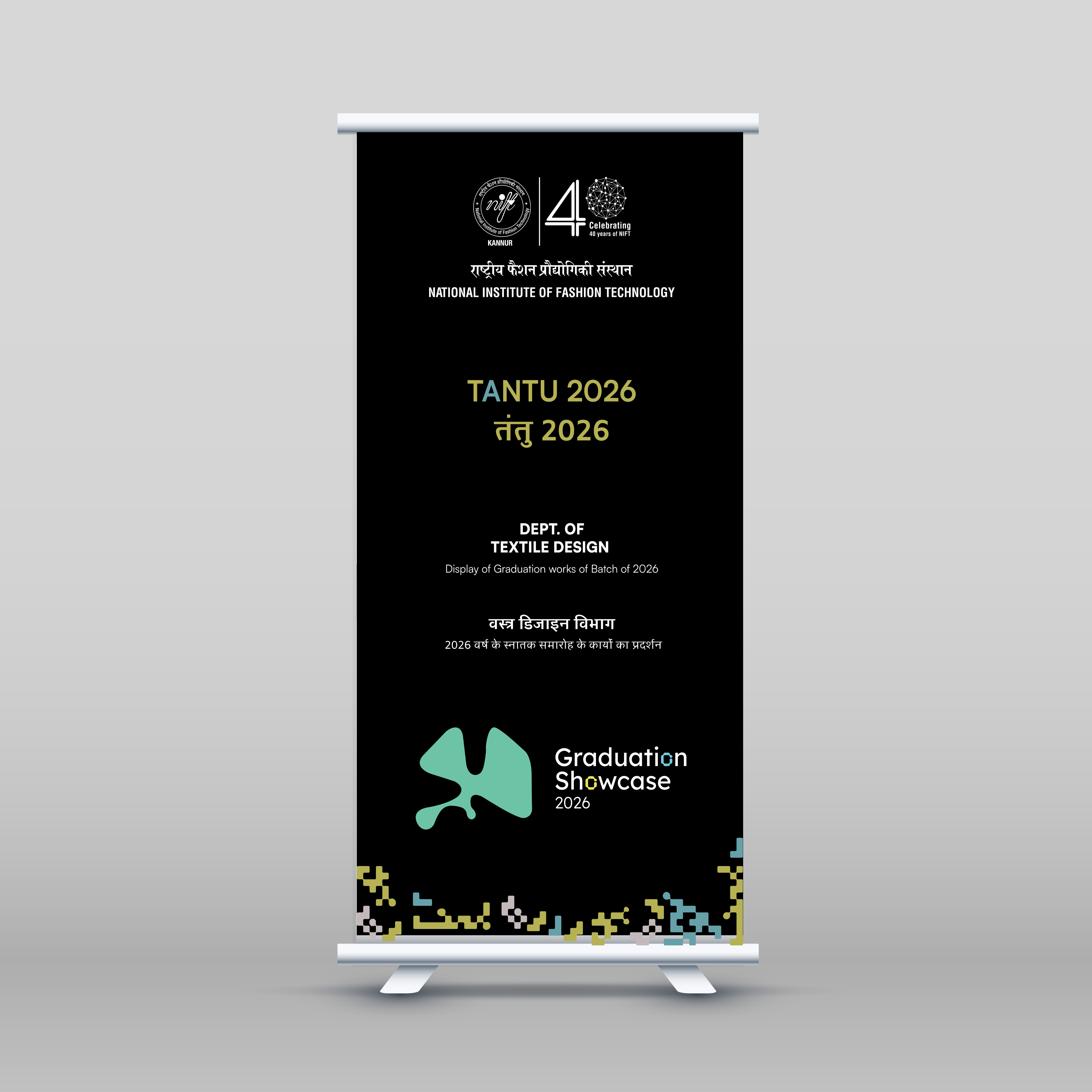
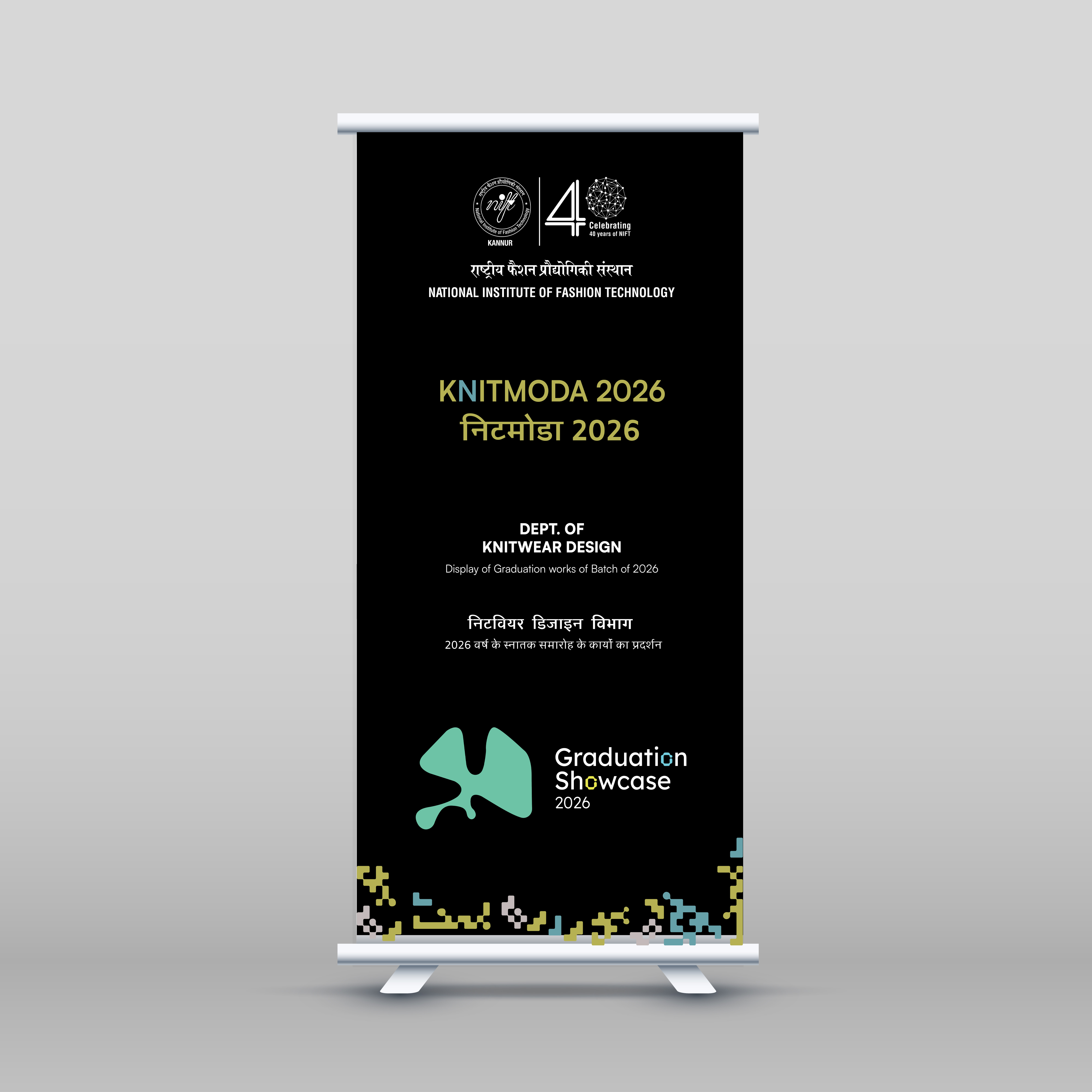
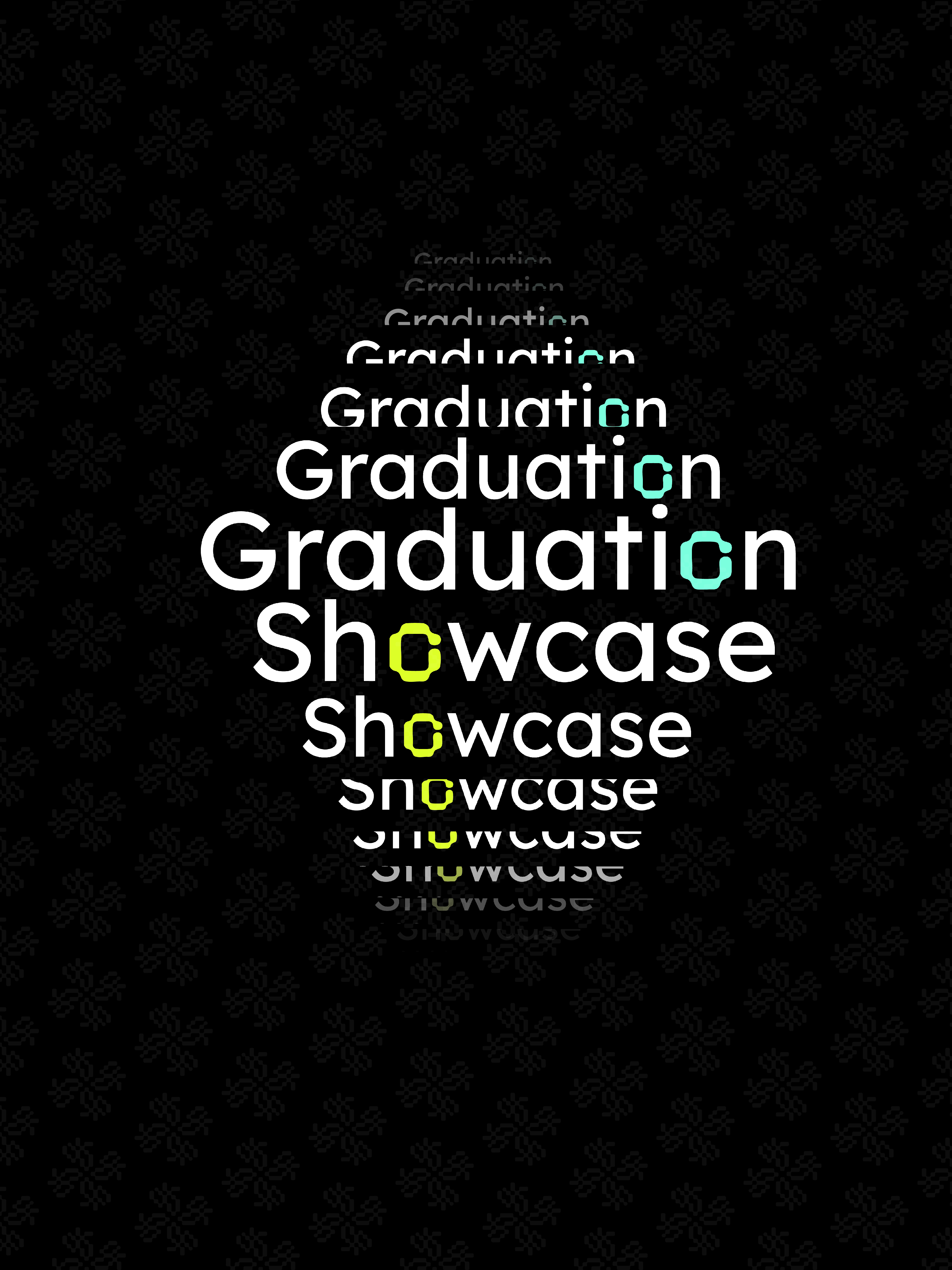
02 Research
Competitive Analysis
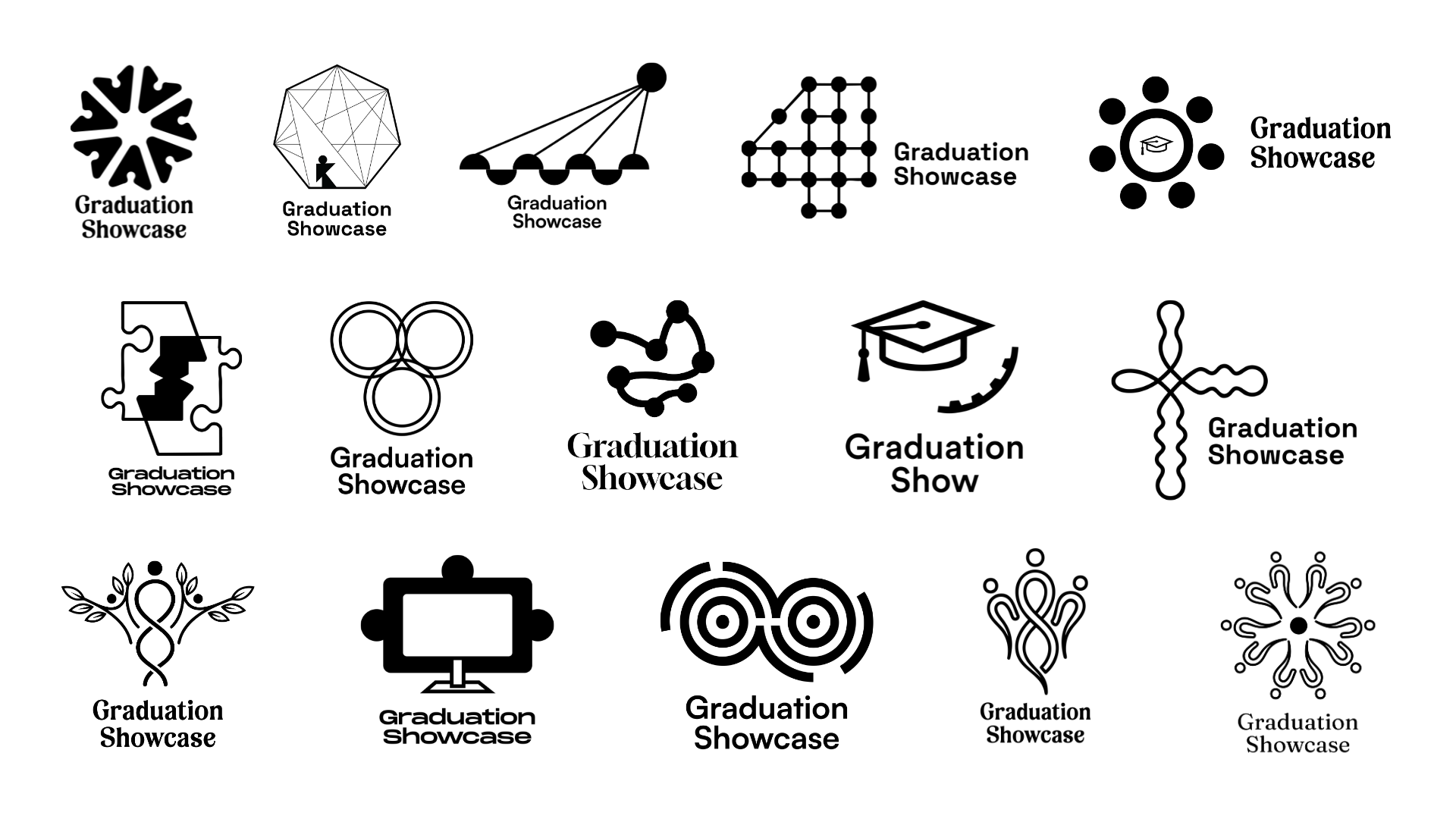
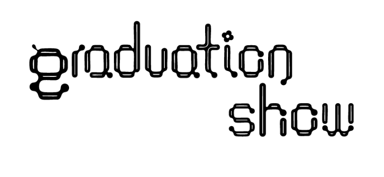
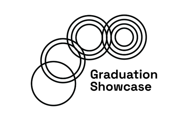
Before conceptualising, we studied six peer graduation show identities to understand the visual language of academic showcase branding — identifying patterns and gaps to inform a differentiated direction.
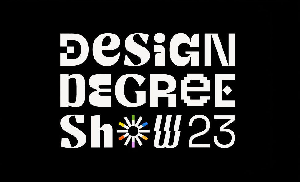
DDS IDC · 2023
Design Degree Show 2023
- Modular geometric shapes — unity and diversity
- Clean minimal style — versatile across scales
- Grid structure reflects academic precision
- Abstract form keeps identity non-literal

NID Ahmedabad
43rd Convocation
- Simple geometric forms — students converging
- Abstract minimal — easy to scale across mediums
- Structured layout reflects design discipline
- Timeless non-literal approach — adaptable
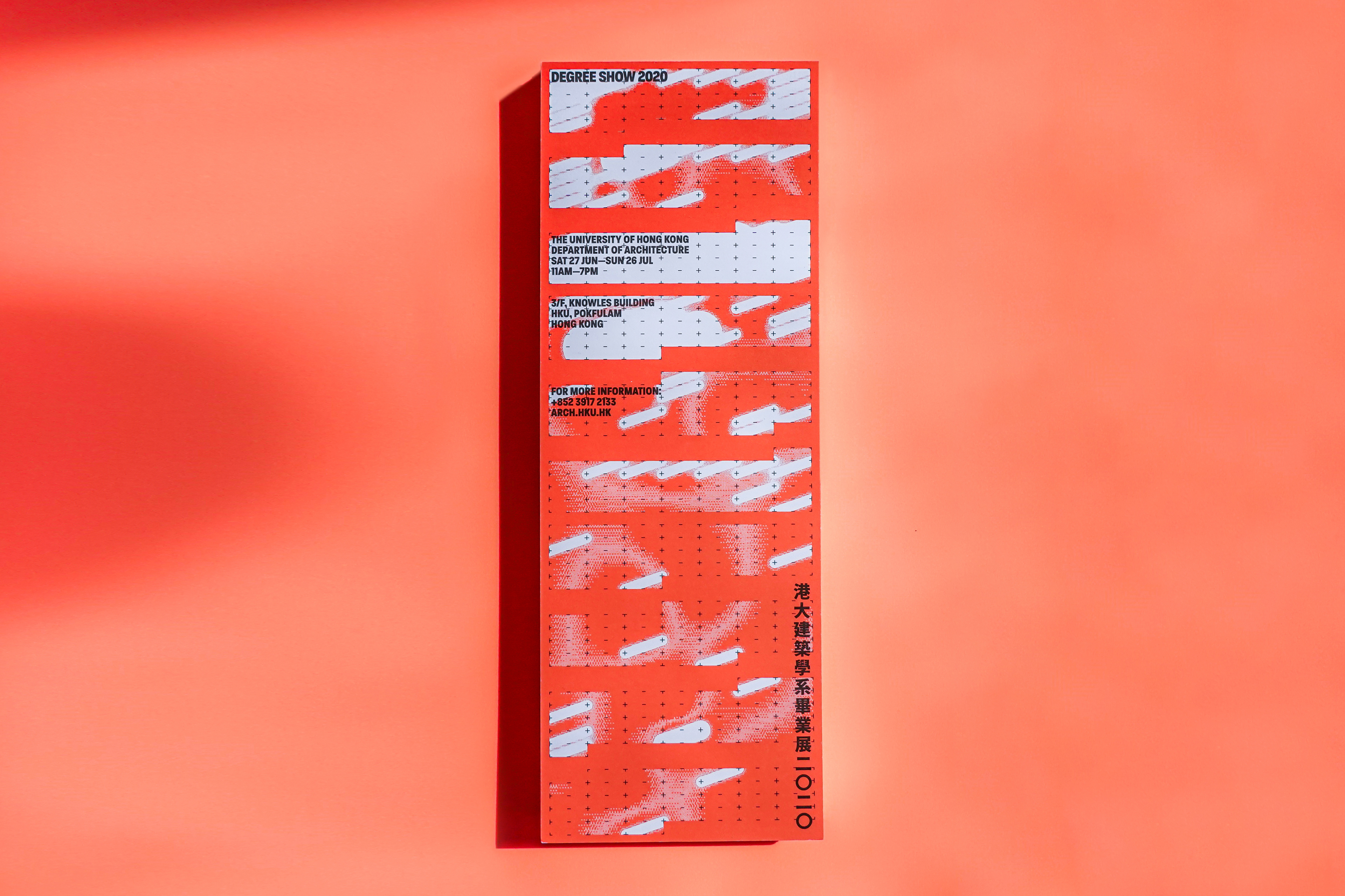
University of Hong Kong · 2019–20
Degree Show 2020
- Abstract calendar markings — academic year
- Monochrome + orange accent — clarity and impact
- Concept-driven non-literal — flexible and timeless
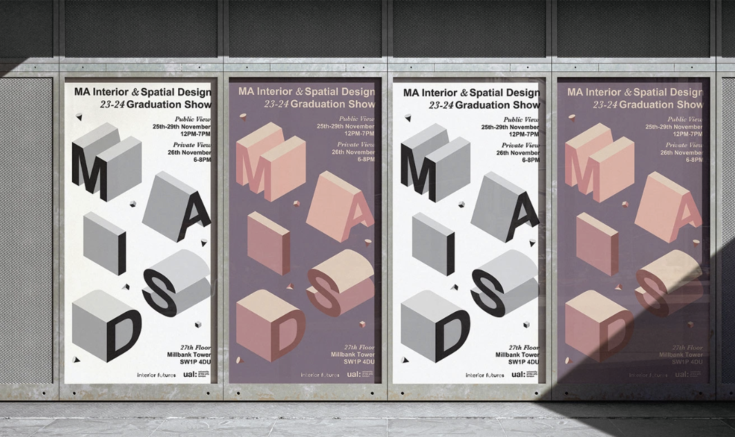
UAL MAISD · 2023–24
Graduation Show
- Programme name as bold spatial graphic
- Neutral design supports diverse student work
- Abstract format — digital and physical adaptable
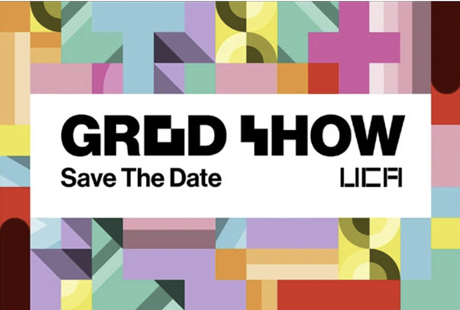
UCA · 2024–25
Grad Show
- Modular geometric forms — no literal imagery
- Minimal style — scales across large event formats
- Abstract shape — versatile and easy to adapt
- Strong memorability through simplicity
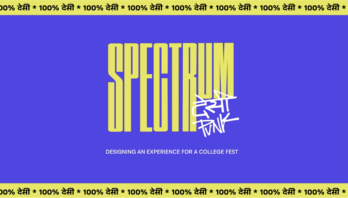
NIFT Hyderabad · Spectrum 23
College Fest Identity
- Bold playful abstract — lively college-fest energy
- Simple geometry — flexible across all formats
- Non-literal design — visually consistent
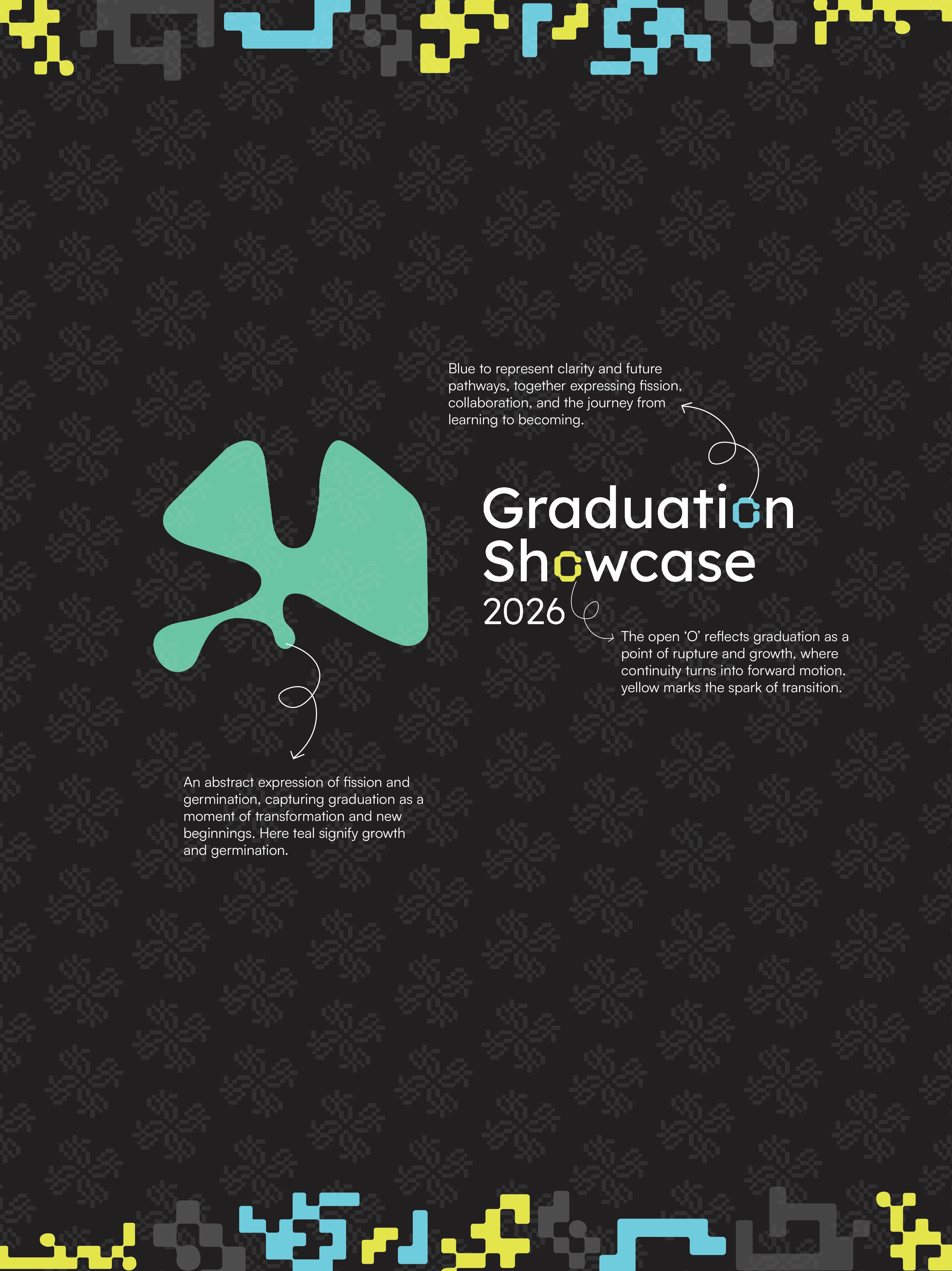
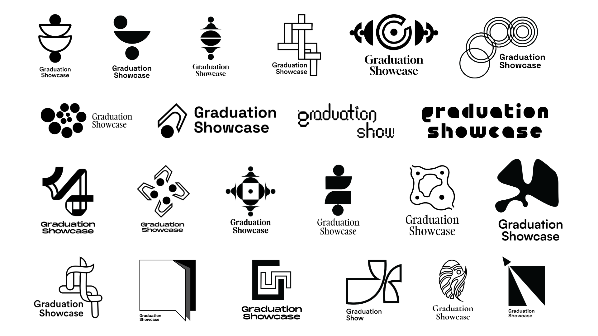
Key Takeaways from Analysis
Abstract over Literal
All strong identities avoided literal
graduation imagery (caps, scrolls) in favour of abstract forms that carry conceptual meaning.
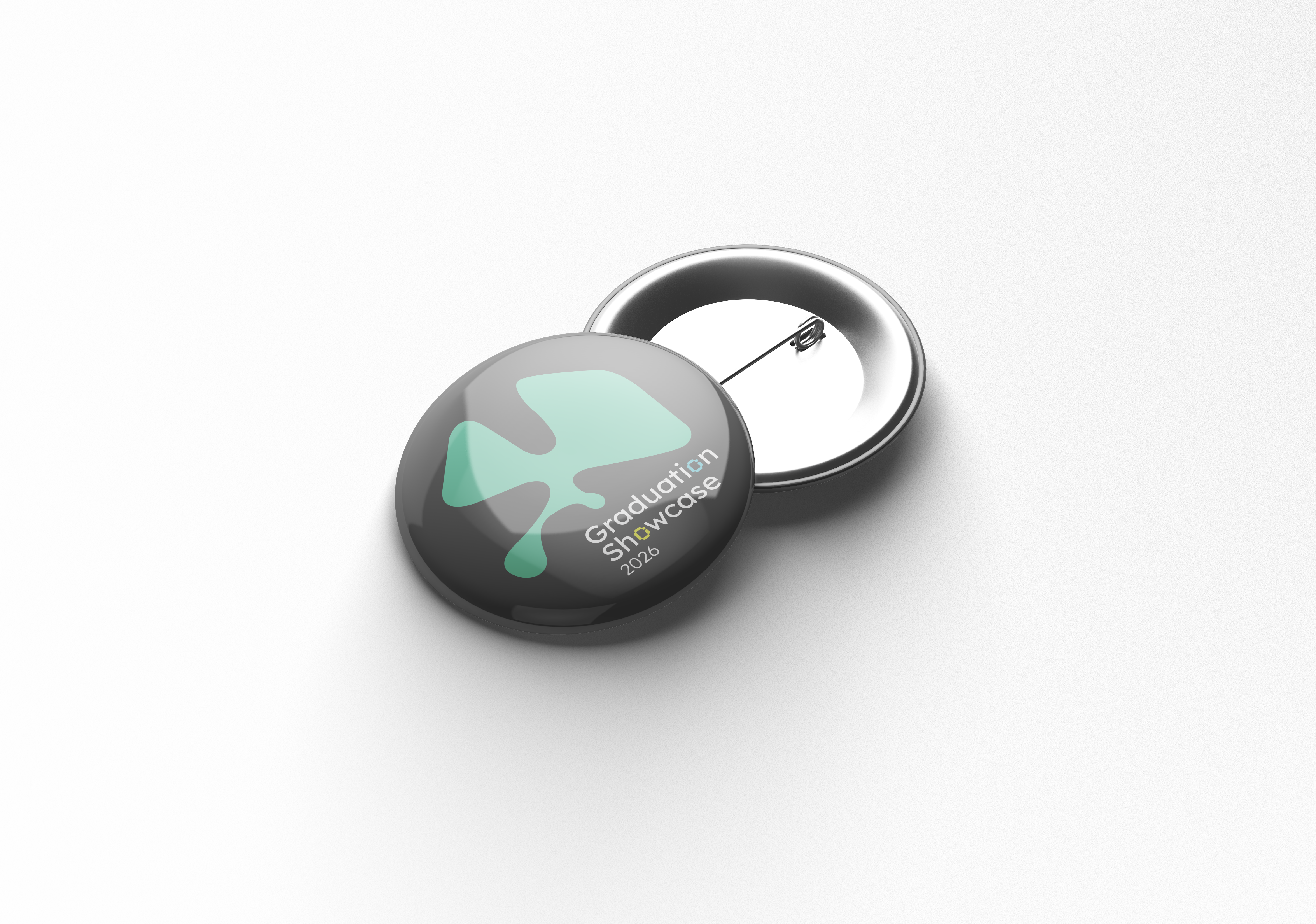
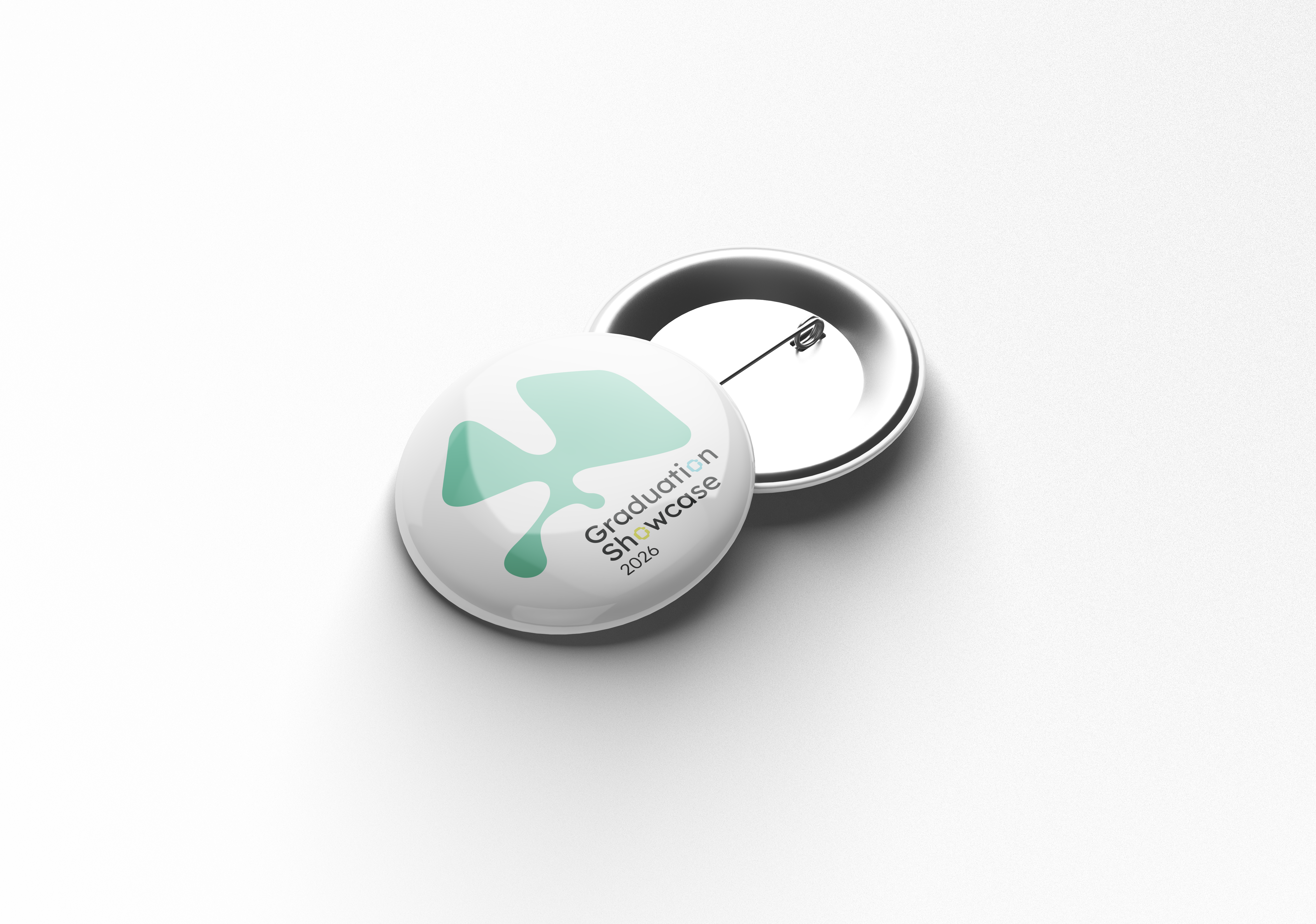
Scalability is Critical
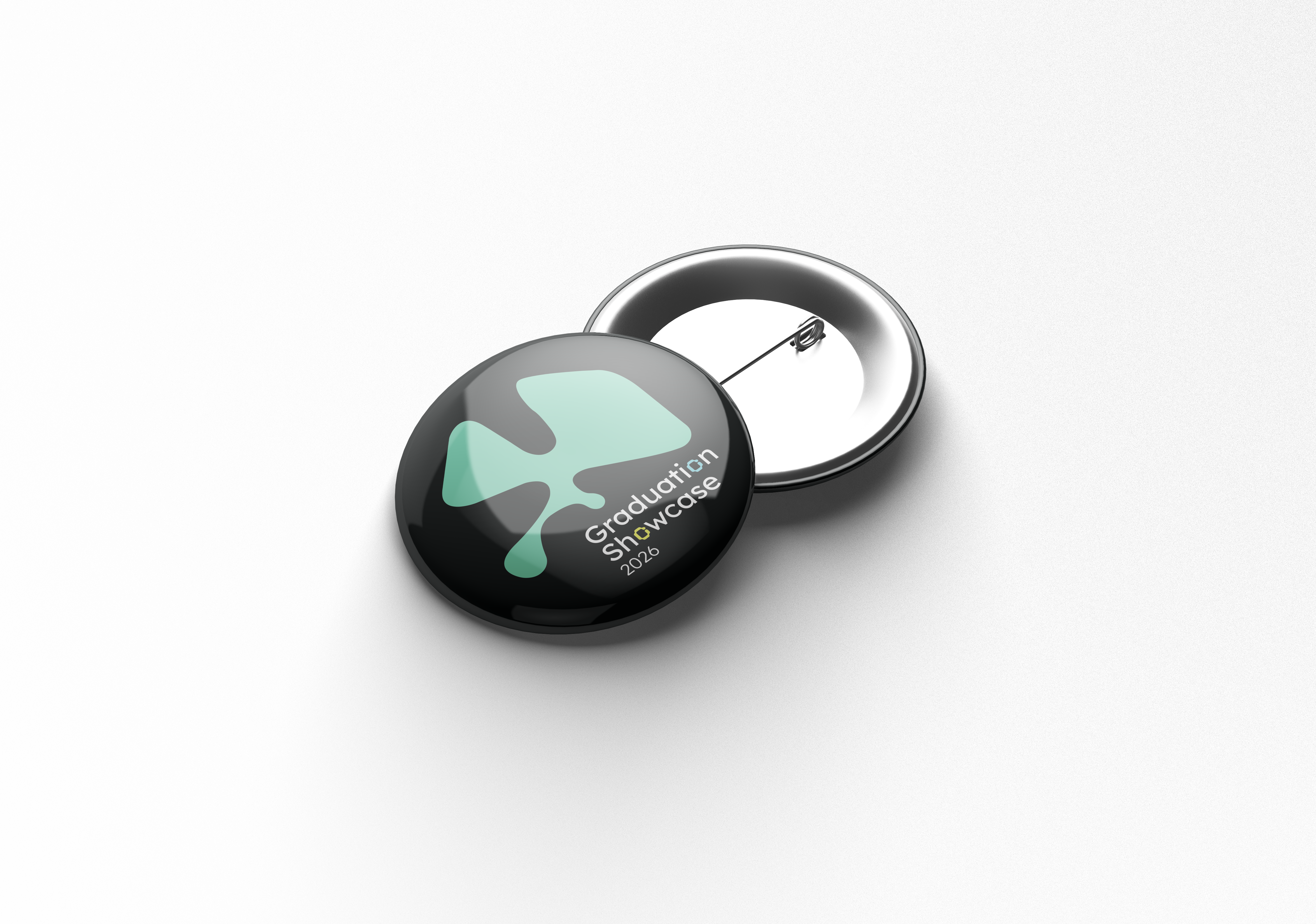
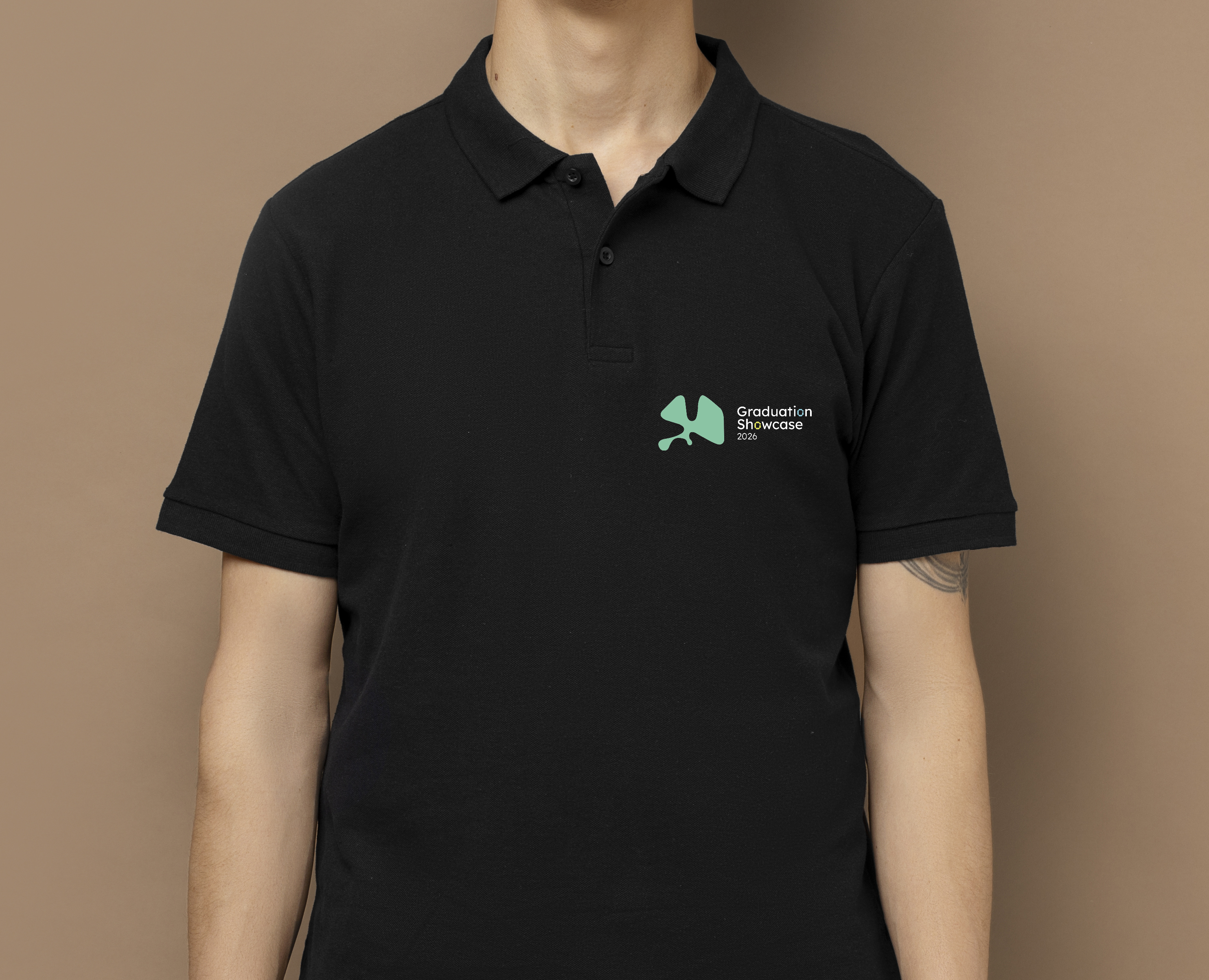
Logos must work from 4cm badge to full
auditorium backdrop — minimal forms with strong silhouettes win at all sizes.
Conceptual Anchoring
The best identities have a clear
conceptual rationale that extends across all applications and can be articulated simply.
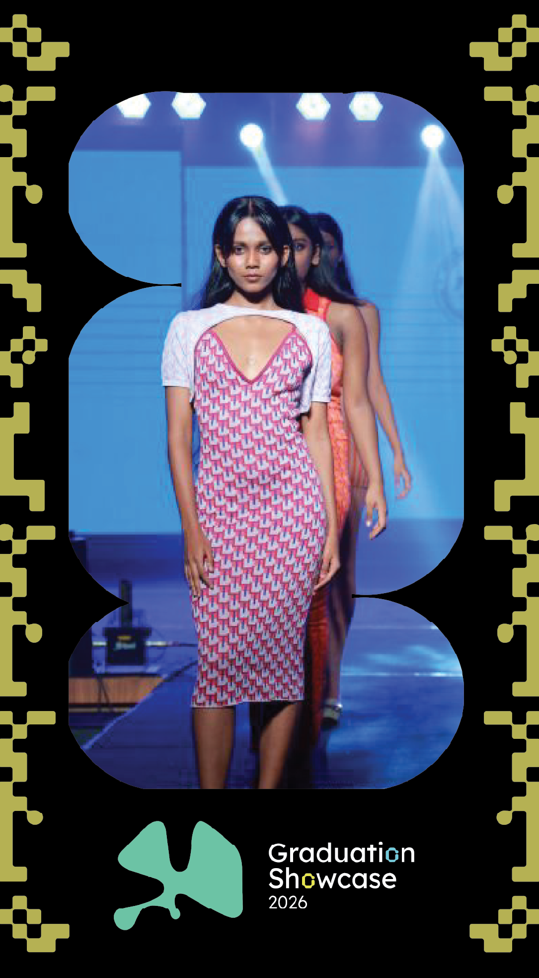
 (1) (2).png)
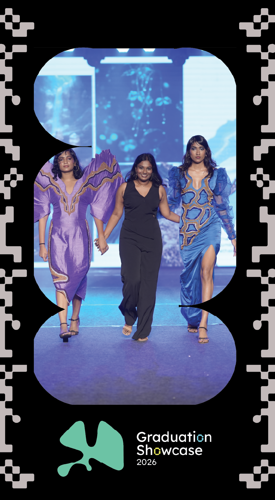
.jpg)