0%

ReflexLabs.AI

Website Redesign — From unclear identity to creator-first platform

Project Type

UX Research + UI Design

Duration

1 Month Internship

Deliverable

Homepage + Team Page

Internship Project

This project was done during a UI/UX Design Internship at ReflexLabs AI. The work reflects real-world constraints — a brief, a one-month timeline, and deliverables that were reviewed and implemented by the brand.

01 — The Brief

A launchpad that didn't look like one.

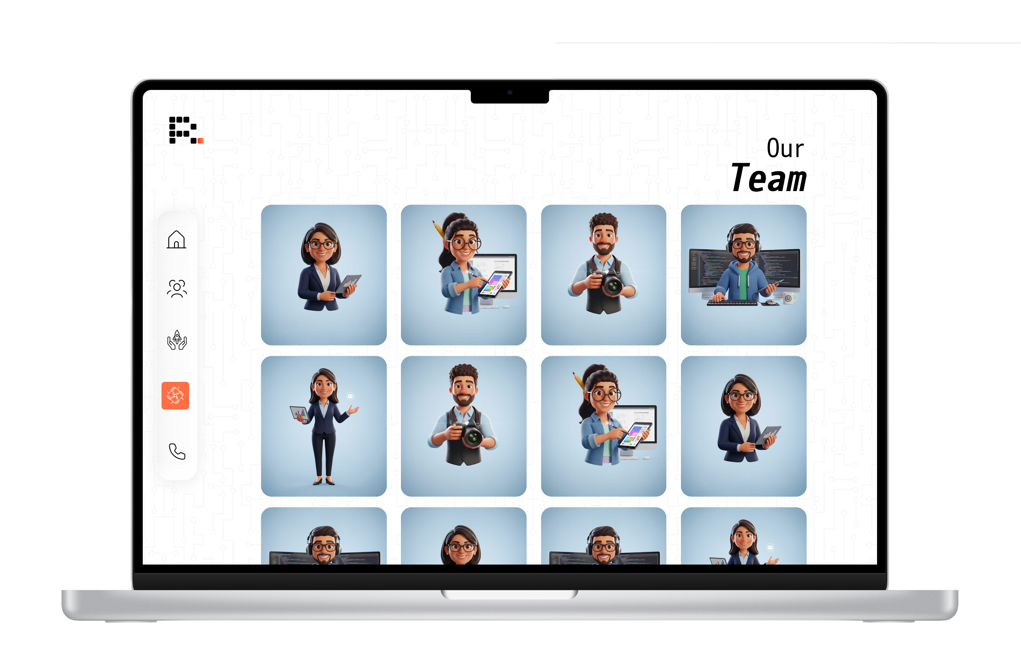
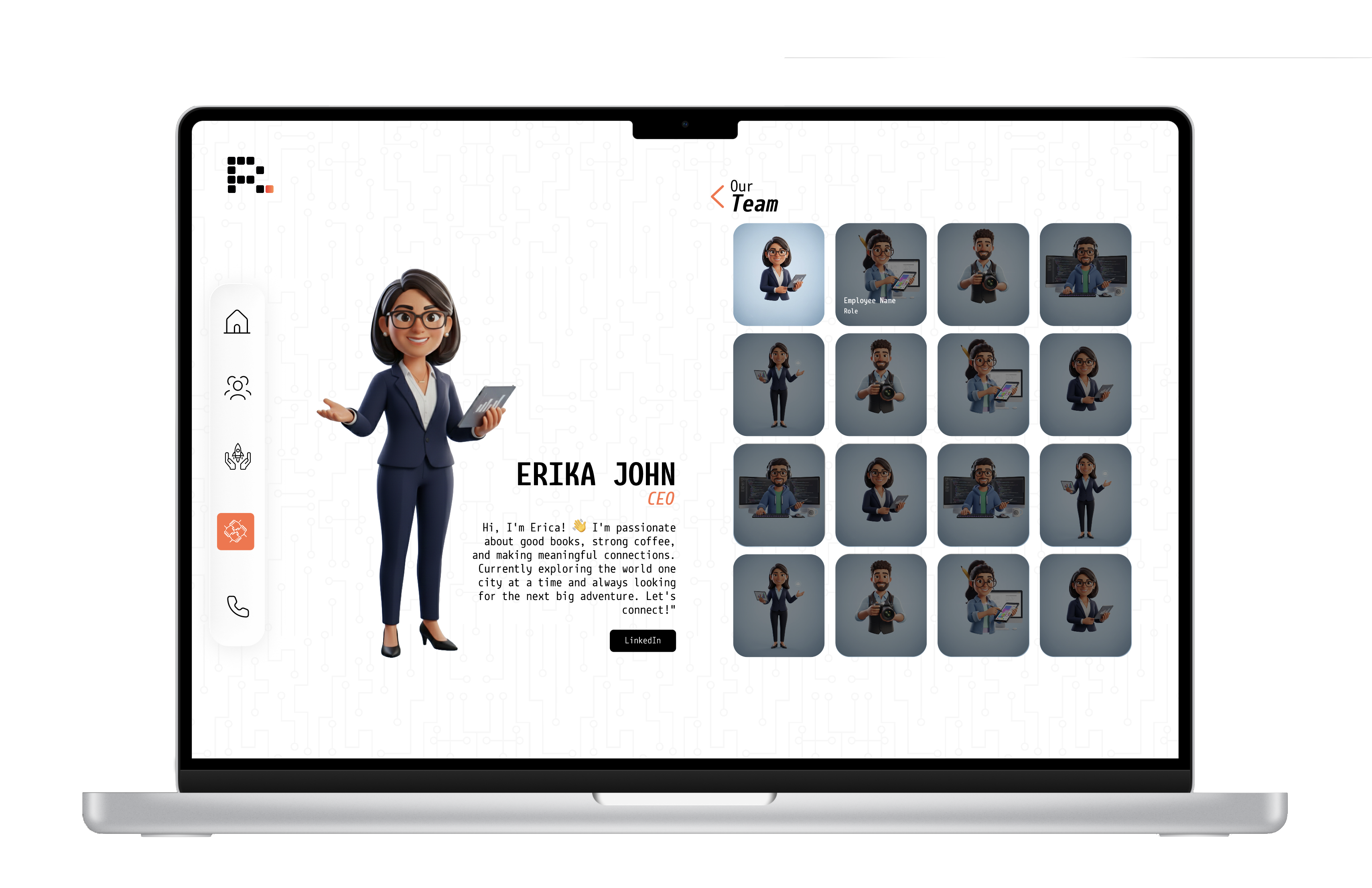
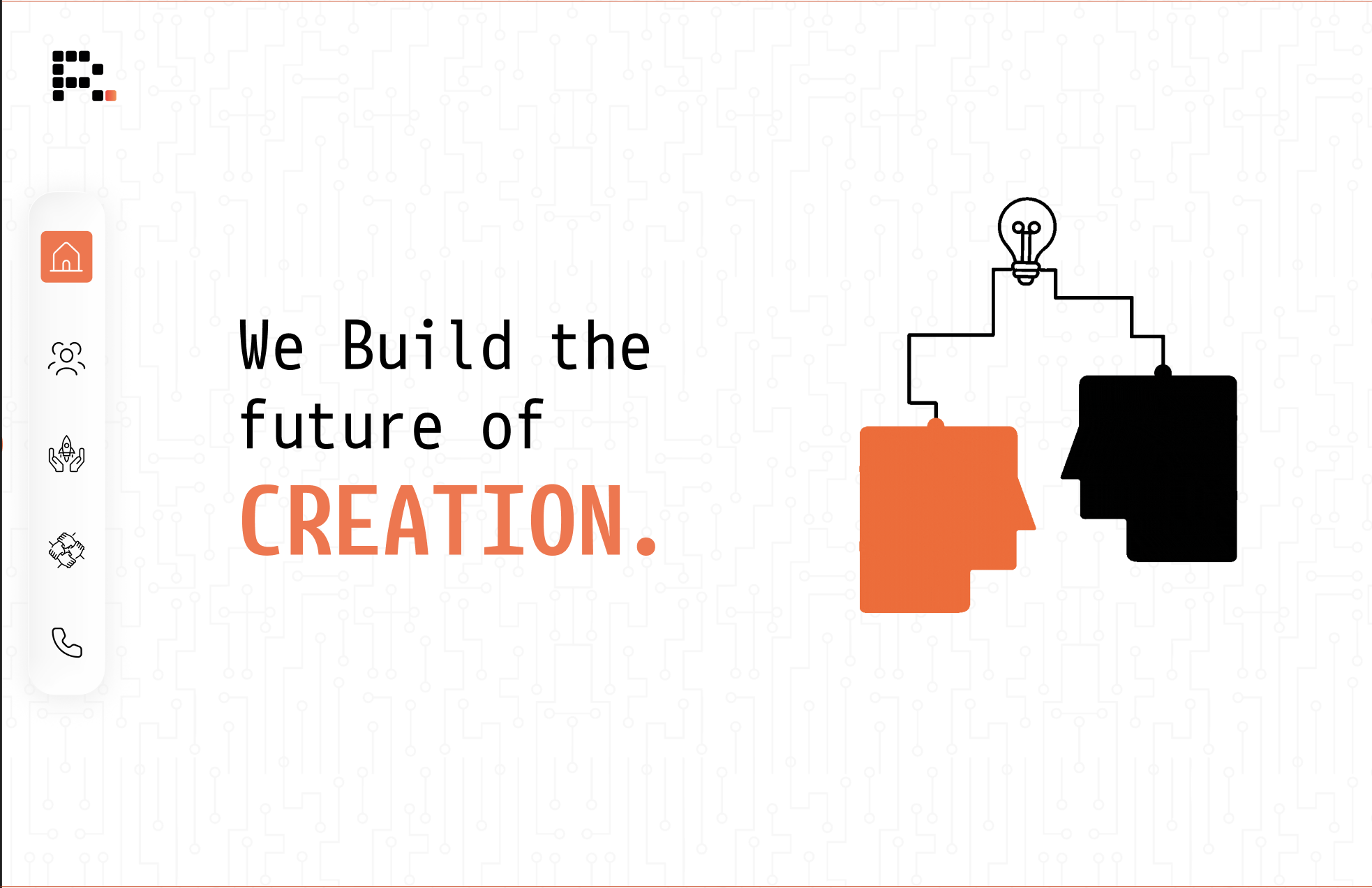
During my internship at ReflexLabs AI, I was tasked with addressing a core challenge: the existing website failed to communicate the brand's true identity. While ReflexLabs had a powerful story — built around its two founders, a symbolic handshake, and the iconic orange pixel — these core elements were missing from the experience.

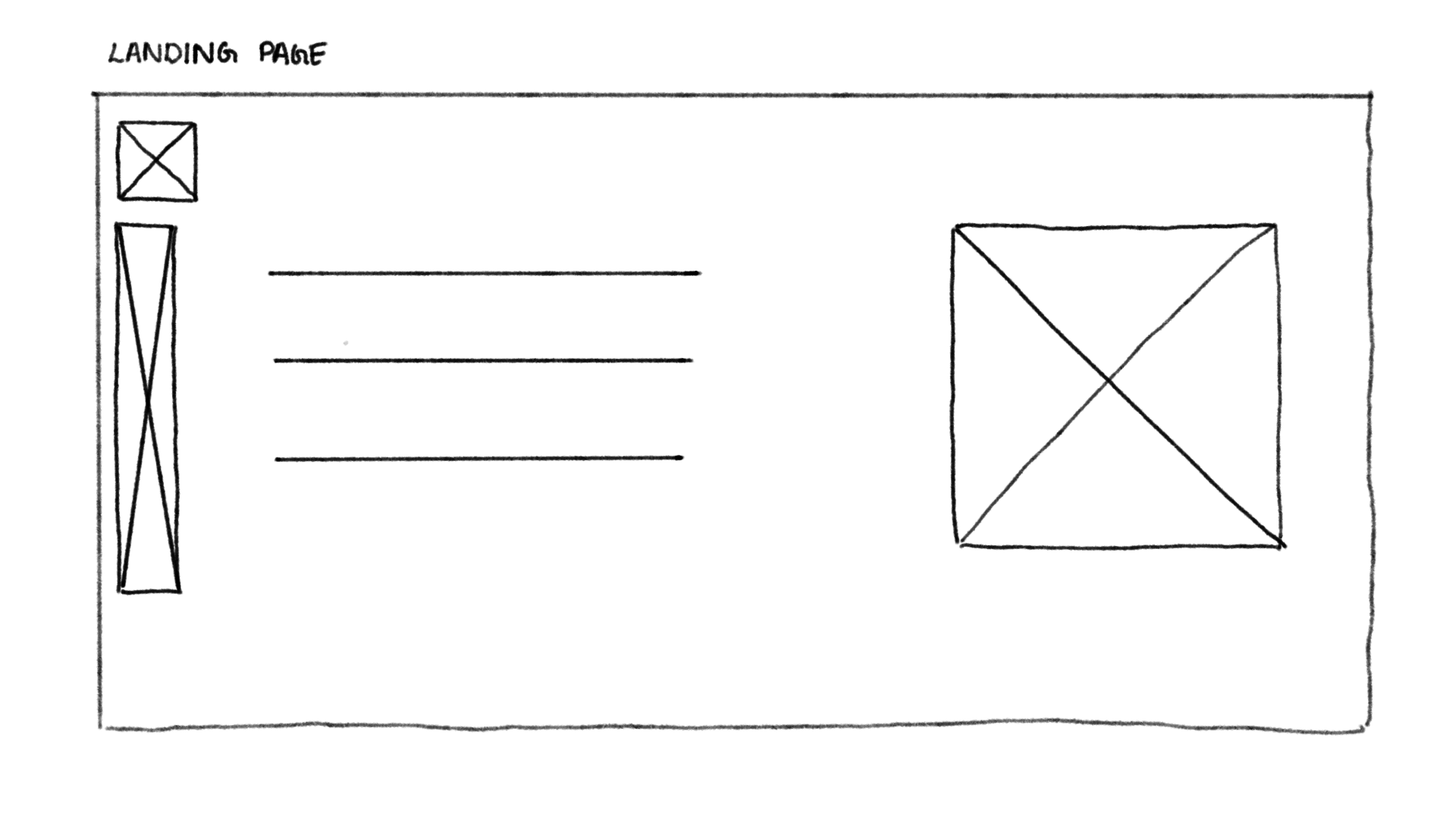
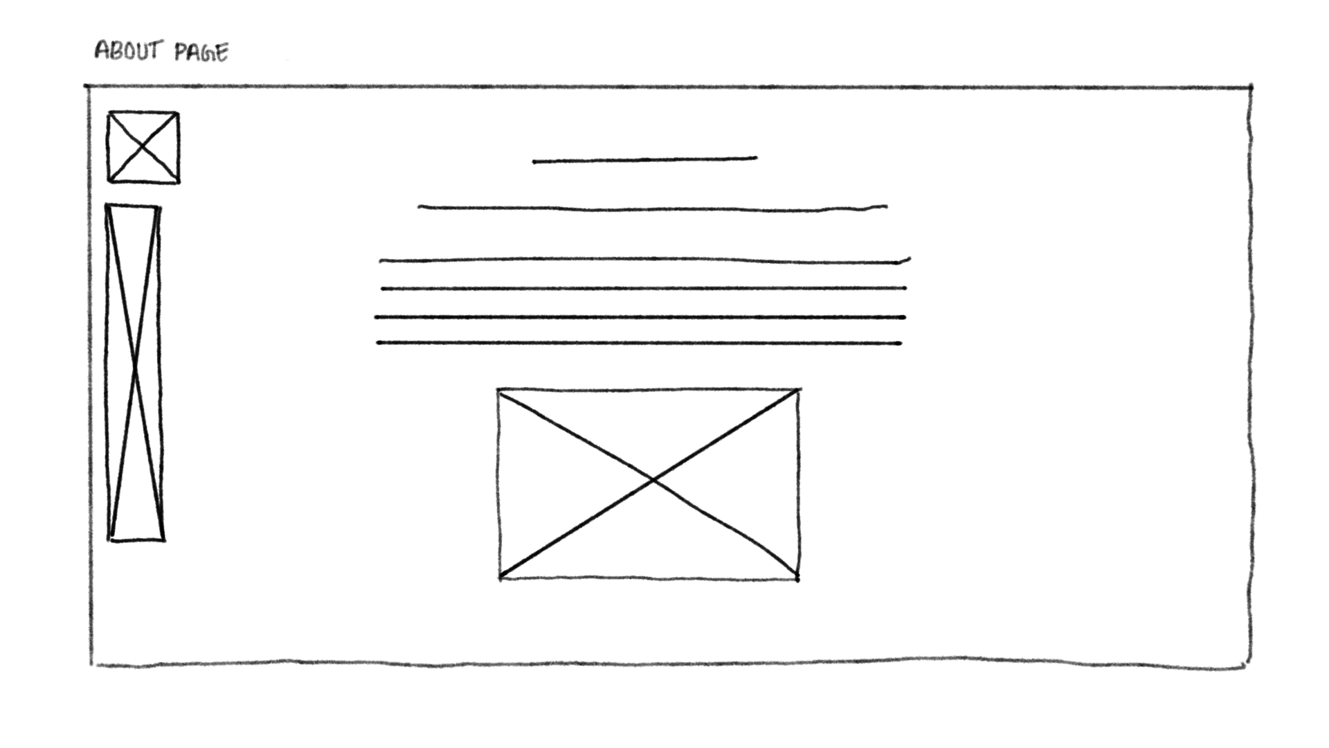
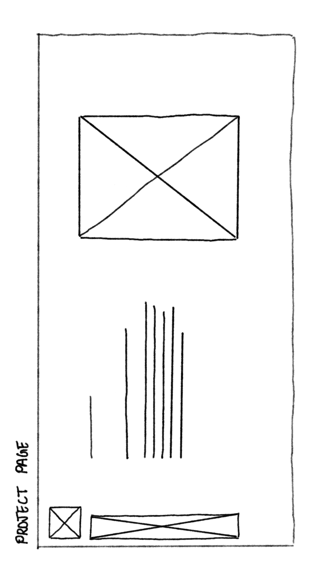
The objective was clear: redesign the homepage and team page to make the platform feel approachable, credible, and true to its creator-focused mission.

"Make the last pixel orange."

— Basil's father, on the brand's defining moment

That single suggestion gave ReflexLabs its identity — a spark in the system, the human touch in an otherwise digital product. Our redesign had to carry that spirit forward.
Existing Website — Before Redesign
Before

The brand promised to catalyze the next wave of digital innovation. The website looked like it had never heard of it.

— Core problem statement driving the redesign
02 — Problem Statement

Three gaps. One broken first impression.

01
No Identity

The existing site had minimal use of the brand's defining elements — the orange pixel, the innovation-first tone, the creator narrative. Visitors had no way to feel the brand's personality.

02
No Trust Signal

There was no team page, no founder story, no social proof. For a platform asking creators to invest time and money, this made the brand feel anonymous and unaccountable.

03
No Proof of Work

Past ventures like Lily AI — a validated hotel bot — were nowhere to be seen. Visitors couldn't assess the platform's capability or track record before committing.

03 — Design Process

Design Thinking. Five stages.

01
Empathise

Competitor analysis of 3 platforms. Social listening. Client brief deep-dive. Understanding who visits and why they leave.

02
Define

3 user personas. Empathy mapping across user types. Identifying the core trust and identity gaps.

03
Ideate

Information architecture. Wireframe sketches. Design system — colours, typography, iconography.

04
Prototype

Medium and high fidelity screens in Figma. Interactive prototype for client review and iteration.

05
Test

Internal review walkthrough. Client feedback loop. Handoff and implementation review.

04 — Competitor Analysis

What others do. What we don't.

Benchmarked against 3 platforms operating in adjacent spaces — VC launchpads, design studios, AI product builders. The gap ReflexLabs could own was clear: creator-first, approachable, human.

ReflexLabs AI
Before redesign
Navigation
Text links, unclear hierarchy
Branding
Minimal, unclear purpose
Work Display
Not shown
Team
None
Visual Identity
Underused orange + black
Opportunity
Needs clarity, approachability, stronger recall
Antler
VC Launchpad
Navigation
Structured, section-defined
Branding
Professional, VC corporate tone
Work Display
Startups highlighted
Team
Founders + advisors
Visual Identity
Corporate palette
Opportunity
Differentiate: creator-focused, execution-oriented
Hexa
Design Studio
Navigation
Clean, clear separation
Branding
Minimalist studio authority
Work Display
Ventures with clean visuals
Team
Listed, static
Visual Identity
Authority-driven minimalism
Opportunity
Differentiate: approachable UI, interactive elements
All Turtles
AI Product Builder
Navigation
Product-focused
Branding
AI product-building, technical
Work Display
Portfolio emphasized
Team
Team listed
Visual Identity
Neutral, technical
Opportunity
Differentiate: approachable, clear creator value
05 — User Personas

Three users. Three reasons the site fails them.

Each persona represents a distinct user need that the existing site was actively working against. These aren't archetypes for decoration — they drove every design decision that followed.

Persona 1: Arjun
Persona 01
Arjun
26 · Startup Founder · Bangalore
High (4/5)

No team page → no trust → no sign-up

Wants to know who's behind the platform before investing time or money. Credibility is everything for a first-time founder.

  • Find a trusted platform to launch his startup idea
  • Verify the team's credibility before committing
  • See real proof of past work before signing up
  • No founder or team information anywhere
  • Cannot verify expertise or background
  • Hesitates to sign up due to lack of transparency
Persona 2: Anita
Persona 02
Anita
34 · Aspiring Entrepreneur · Kochi
Low (2/5)

No work shown → no proof → no trust

A homemaker turning passion into business. Needs visible proof and simple language — not promises and jargon.

  • Find a platform that speaks her language, not tech jargon
  • See success stories she can relate to personally
  • Understand the service without needing a tech background
  • No case studies or real success stories
  • Cannot relate — no small business representation
  • Intimidated by technical language without clarity
Persona 3: Kabir
Persona 03
Kabir
24 · UX/UI Designer · Delhi
Expert (5/5)

Weak branding → no inspiration → no connection

Values aesthetics and coherence. A platform promising digital innovation must demonstrate it through its own interface.

  • Find a platform that reflects strong design thinking
  • Collaborate with a team that values visual craft
  • Be inspired by a brand before committing to it
  • Website feels visually bland and disconnected
  • No distinct brand identity to build trust from
  • Inconsistent visual structure throughout
06 — Empathy Mapping

Inside the user's head.

Mapping what users say, think, do, and feel helped us move past surface complaints and understand the emotional state driving their behaviour on the site.

SAYS
What they say out loud
  • "What exactly does this platform do?"
  • "Who is behind this product?"
  • "Can this really help someone like me?"
  • "Do they have any real success stories?"
  • "Where do I even start?"
  • "This doesn't look very engaging."
THINKS
What they think silently
  • This feels unclear and difficult to trust
  • I want to know who is behind this platform
  • I need proof before committing anything
  • They promise a lot — but where's the evidence?
  • I might be wasting my time here
DOES
Observable behaviour
  • Scans the site for team info or credentials
  • Searches for portfolio, case studies, testimonials
  • Scrolls quickly trying to understand the offering
  • Compares with other platforms immediately
  • Leaves the site if clarity isn't found fast
FEELS
Emotional state
  • Uncertain about the platform's legitimacy
  • Skeptical — too many promises, too little proof
  • Confused by unclear information architecture
  • Uninspired by the visual experience
  • Hesitant — on the edge of leaving
  • Overwhelmed by lack of a clear entry point

Key Insight

Users weren't failing to understand the product — they were failing to trust it. Clarity and credibility had to come before any other design decision.

07 — Information Architecture

Structuring content so users stay.

The IA was built around one principle: earn trust, then earn action. Every section exists to answer a question the user is already asking before they ask it aloud.

Information Architecture Flow
08 — Design System

A cohesive visual language.

Colour Palette

#000000

#FF6E43

#FFFFFF

#262626

Typography — Sudo Var

Sudo Var
Bold
Sudo Var
Regular
Sudo Var
Italic
09 — Wireframes

Low-Fidelity Wireframes.

Landing Page

Landing Page

About

About

Projects

Projects

Team

Team

Inside Team 1

Inside Team 1

Inside Team 2

Inside Team 2

Contact Page

Contact Page

Mid-Fidelity Wireframes.

Preload Animation

Preload Animation

Handshake Animation

Handshake Animation

Landing Page

Landing Page

About

About

Projects

Projects

Team

Team

Inside Team 1

Inside Team 1

Inside Team 2

Inside Team 2

Contact Us

Contact Us
10 — Final UI Screens

The orange pixel comes alive.

High fidelity screens for the homepage and team page — Sudo Var, orange on black, pixel-grid motifs carrying the brand identity through every section.

Homepage

High Fidelity Hero

Team Pages

Team Inside 1 Team Inside 2
11 — Design Details & Elements

The DNA of the redesign.

A modular, scalable design system built on custom pixel-grid logic. Every element—from navigation to the core identity—carries the same futuristic blueprint.

Preloading Animation

A minimal loading screen that keeps users engaged during wait time, using a dotted circular motion and the brand’s orange and black palette for consistency.

Handshake Element
Handshake Micro-animation

An abstract handshake visual built with simple shapes, where forms move apart in the transition and come together in the contact page, symbolizing both the beginning and completion of collaboration.

Landing Page Animation

Two abstract figures, also resembling chat bubbles, interact to form a lit bulb, representing ideas generated through communication between the user and the platform.

Interactive Prototype.

Disclaimer

This prototype was developed during my internship and is intended to demonstrate design structure and user experience. Due to confidentiality constraints, actual project names, and team member details were not disclosed and have been represented using placeholders. For more information about the organization, visit reflexlabs.ai.

11 — Before / After

Same brand. Different story.

Before

Before Redesign
Unclear brand purpose
No team or founder presence
No work or case studies shown
Weak visual identity
Confusing contact / CTA

After

After Redesign
Clear mission + narrative from hero
Dedicated team page with founders
Lily AI venture showcased as proof
Cohesive orange pixel brand language
Clear CTA + structured contact
ReflexLabs AI

STOP
DREAMING.
START
BUILDING.

Project

ReflexLabs AI Website Redesign

Role

UX Research + UI Design

[BACK]